
An architect's take on the new Sturgis Museum and Hall of Fame
An architect's take on the new Sturgis Museum and Hall of FameI’m sorry. I am truly, painfully, cringefully sorry. As an architect, I would like to...

I’m sorry. I am truly, painfully, cringefully sorry.
As an architect, I would like to apologize on behalf of my profession to bikers everywhere for the design of the new Sturgis Motorcycle Museum & Hall of Fame. You deserved better.
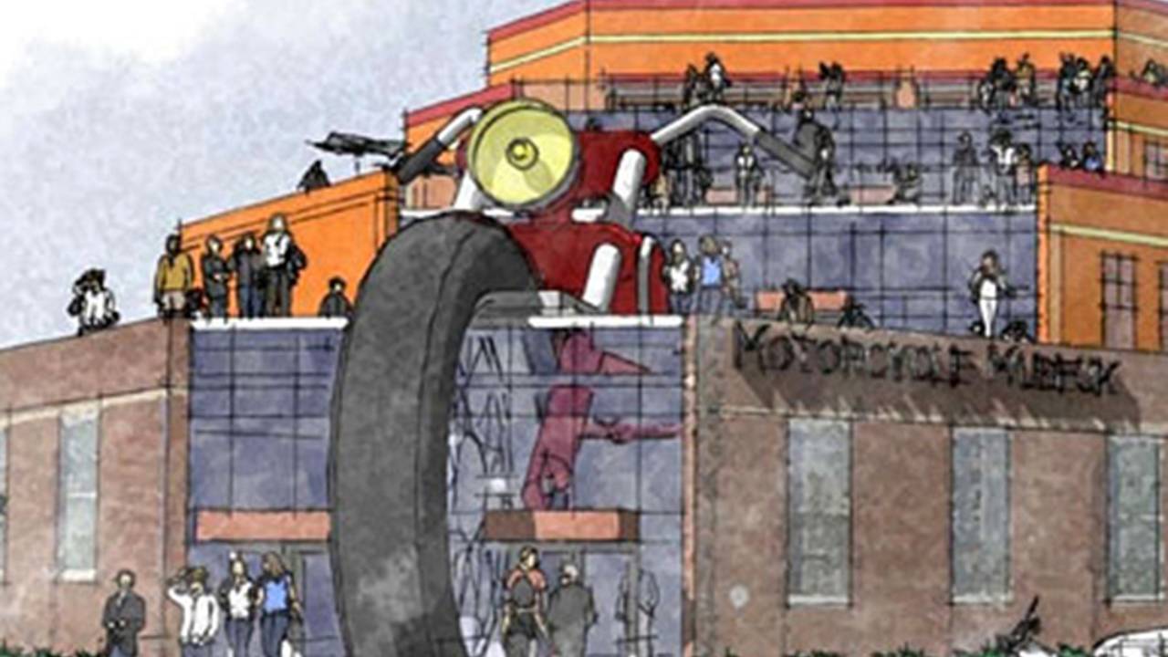
The Museum recently unveiled initial concept drawings for their new expansion, which is part of a larger Sturgis downtown revitalization effort. Now, if at first the museumization of something as woolly and un-polite as one of the world’s largest motorcycle rallies seems odd, it shouldn’t. The nature of museums has changed so much in the last two decades, as has the nature of the rallies, that they were bound to intersect. Sturgis has a right to capitalize on what they’re famous for, and museums today are seen as important economic drivers. This could be the Bilbao of the Black Hills. If I were rolling down Junction Ave., I would certainly take a lap through the Museum. More power and much success to them.
What is so disappointing here is the design of the building itself. Most of the building is simply, soullessly bland. You could easily remove the “Museum” sign and replace it with “CVS,” and it could happily, anonymously inhabit any American streetcorner. If this were all there were to the building, no comment would be necessary – or possible. It is the building’s primary ornament that makes it impossible to just let this one slide.

In what appears to be the sole considered design element of this edifice, the giant, aborted front half of a – have you guessed it yet? – motorcycle emerges through the main atrium. It is a gesture that is simultaneously grand and dull. Predictable and unbeliveable. Bold and cheap.
Let me be clear here: the design of this building is clearly, maybe intentionally, tacky, but that is not my objection. Tacky can be great. America has a rich legacy of kitch. For eaxmple, the apparent inspiration for this building is that other great South Dakota landmark, Wall Drug. But Wall Drug and the like are fun in a big, un-self-conscious, Zippy-the-Pinhead kind of way. This is just terrible in a terrible way. Instead of Zippy, we get a design that could have been done by the crocodiles from “Pearls Before Swine.” I picture them standing around with self-congratulatory grins, saying, “Eet have beeg MOTO-SI-KOO!”
No, the tackiness is fine. The problem is that this is lazy. It’s the very first thing a five-year-old would think of, and not refined or developed any further from that point. I understand that this is only an initial concept design, but I literally would expect better from a first-year design student.
When Denise Scott-Brown and Robert Venturi published Learning from Las Vegas in the 1970s, they were among the first to take seriously buildings that most critics did not consider “high architecture.” One typology they identified was buildings they called “ducks,” after “The Big Duck” on Long Island, a stand where one could buy ducks and duck eggs. “Ducks” are, aptly, buildings shaped to iconographically identify their purpose, like an ice cream shop shaped like a cone. Every architecture student is as familiar with this as med students are familiar with metacarpals. Rightly or wrongly, “ducks” have become a definitive element of post-modernism in architecture.
A famous example is the Longaberger Home Office in Newark, Ohio, which is, ahem, shaped like Behemoth’s picnic basket, and which is often derided by self-styled intellectuals like myself. I never thought that I would consider the Longaberger basket building an edifice of comparative elegance and sophistication, but here we are. Look at how well the windows are integrated into the weave of the basket (God! What am I saying!?). See, the Sturgis Museum is not a “duck.” It is just the decapitated head of a “duck” taped onto a cardboard box.
What an incredible missed opportunity this is. So many rich sources of inspiration ignored for the sake of the obvious gag. Imagine what a truly talented architect (maybe someone like Overland Partners or Antoine Predock or the mad genius Bart Prince) could have done with the inspiration of the landscape of the Black Hills, the rough materials of the roadhouses, the feel and ethos of the place. It needs to be more unwashed. Where is the grit in this design? Where is the windburn and the stiffness of the road? That special funk that only comes from leather worn directly against skin. Spilled beer and grease. The blue tang of burnt oil. Filth. Love and exuberance. OK, hell, I’ll say it: freedom! Where is the lust in this building?
Tom Robbins said there are only two mantras: yum and yuck. What this building needs is some yum. I know the design may change entirely between now and construction, but if this goes through, I think it needs a sculpture out front by Claes Oldenburg of a giant crushed beer can. If they do that, then I’m OK with this building. That, or a giant, inflatable Meatloaf riding the bike out of Hell.
I am reminded of the words of my advisor in architecture school, the implacable Dr. Sanabria, who, upon viewing one of my designs, once croaked wearily, “But this… This is not architecture.”
Carter Edman is an architect, writer, and rider in Cleveland, Ohio. He teaches “Motorcycles and American Culture” and other courses at Case Western Reserve University.
Sturgis Museum renderings via Cyril Huze Blog
RECOMMENDED FOR YOU
Video Review: I Tested The Triumph Thruxton 400 and Tracker 400 Motorcycles
Indian Motorcycle Launches Attack Ad On Harley-Davidson. All But Confirms Right-Wing PR Campaign Reporting
Fossil-Fuel Ban On Motorcycles Won't Go Into Effect As Planned In Vietnam, And Honda May Have Played a Role
Honda Is Bringing The CB1000F To The US. Clearly, It Wants To Print Money.
Are You Really Getting The Gasoline You Pay For At the Fuel Pump?
Some Lunatic Is Putting A Turbo Onto a Harbor Freight Motor. Plans Insane Go-Kart
People Have Figured Out How to Track The Lowest Gas Prices Near You